
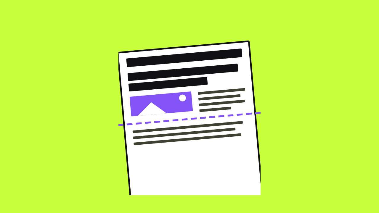
A hero section is the first block a visitor sees on your homepage. It sits at the top, above the fold, before any scrolling. On a service site, it has seconds to say what you do and where.
This guide gives you a simple formula for that space. It covers the headline, the buttons, the image, and the trust cue. It also shows how to keep the hero from slowing your page down.
Reporting note: We checked NN/g, web.dev, W3C, and Google sources on November 10, 2026.
Key takeaways
- Say what you do and where in the hero headline
- Pair one main button with a softer second option
- Use one real photo, with readable text on top
- Never lazy-load the hero image
- Test it on a phone and with a five-second check
What is a hero section?
The hero is the top band of a page, with a big headline and image. The "fold" is the bottom edge of the screen before anyone scrolls. Everything a visitor sees without scrolling is above the fold.
The fold isn't one fixed line. It moves with every screen size, so a phone and a laptop show different amounts. Nielsen Norman Group's fold manifesto notes that a responsive site can have several folds.
That's why your hero needs to work at the smallest common size first. If the key message fits on a phone, it fits everywhere.
Does above the fold still matter?
Yes. Nielsen Norman Group's 2018 scrolling and attention study tracked where people looked. People spent about 57% of their viewing time above the fold. About 74% went to the first two screenfuls.
People will scroll when the top of the page gives them a reason. A vague hero gives them no reason, so many never see the rest. A clear one tells them they're in the right place.
Watch for a "false floor," too. That's a top section that looks complete, so people assume the page ends there. A hint of the next section helps signal there's more below.
What should a hero section include?
Most service business heroes need the same five parts. Keep each one short. The goal is a hero someone can understand in one glance.
- A headline that names your service and your area
- One supporting line about what makes you different
- A primary button for the main next step
- A secondary option for people not ready to commit
- A trust cue, like years in business or a license number
Scroll sideways to read the full table.
| Part | Its job | For example |
|---|---|---|
| Headline | Says what you do and where | Emergency plumbing in Tampa |
| Supporting line | Gives one reason to pick you | Licensed plumbers, upfront pricing |
| Primary button | Starts the main next step | Get a free quote |
| Secondary option | Offers a softer next step | See our services |
| Trust cue | Backs up the claim | Licensed and insured in Florida |
The examples above are hypothetical. Use your own true details. A trust cue only helps if a customer could check it.
Picking a trust cue
A trust cue answers the quiet question, "Can I rely on these people?" Pick one that a customer could verify. Keep it to a short line or a small badge.
- Your license or registration number, if your trade has one
- Years in business, if it's accurate
- Your service area, so people know you cover them
- A written warranty on your work, in plain words
How to write a hero headline that works
Lead with the plain name of your service. Then add your city or service area. Visitors and search engines both read this line first.
Slogans usually lose here. "Your comfort is our passion" could be any business. "Heating and air repair in Brandon" tells a visitor they've found the right one.
Keep the supporting line to one sentence. Pick the one thing customers ask about most, like same-day visits or flat pricing. Only claim what you can deliver every time.
Your buttons should name the result, not the action. "Get a free quote" beats "Submit." Our call to action examples guide has more wording to adapt.
Choosing the hero image
A real photo of your team, your trucks, or your finished work beats generic stock. Don't let stock photos of people pose as your customers or staff. That can mislead visitors.
Pick one strong image. A rotating slider makes people wait to see the right message. It also adds weight to the top of the page.
If text sits on the image, check the contrast. The W3C's contrast guidance asks for 4.5 to 1 for normal text. Large text needs 3 to 1, and a dark overlay can help.
Keep your hero section fast
The hero image is often the largest thing on the screen. That usually makes it the page's Largest Contentful Paint, or LCP, element. LCP measures how fast that main content shows up.
Google's web.dev team calls 2.5 seconds or less a good LCP score. It measures that at the 75th percentile of page loads, on mobile and desktop. Google's Core Web Vitals page recommends site owners aim for good scores.
These steps come from web.dev's guides to optimizing LCP and layout shift. A developer can usually handle them in an afternoon.
- Don't lazy-load the hero image, since that delays it
- Add fetchpriority="high" to the hero image tag
- Put the image in the page's HTML, not only in CSS
- Serve it at the size it's shown, in WebP or AVIF
- Set width and height so the page doesn't jump as it loads
A fast hero won't fix everything on its own. It does remove a reason for people to leave before they read anything.
Hero section design on mobile
On a phone, the fold comes much sooner. Stack the headline, the supporting line, and the main button. Let the image sit behind or below them, not above.
Make the main button big enough to tap with a thumb. For urgent services, a tap-to-call button often fits best. Keep it in view without covering the headline.
Skip pop-ups that cover the hero on arrival. Google's guidance on intrusive interstitials warns against hiding the page this way. It suggests small banners instead.
Hero section mistakes to skip
- A clever slogan instead of your service and area
- Three or more buttons that compete for attention
- Auto-playing video that hides the message on phones
- Text over a busy photo with weak contrast
- A trust badge or award you can't back up
- A hero so tall that nothing else peeks above the fold
How to check your hero section
Try a five-second test. Show your homepage to someone outside the business for five seconds. Then ask what you do, where, and what they'd click.
If they can't answer, simplify the headline first. Then run the page through PageSpeed Insights. Its report names the LCP element and suggests fixes.
Check on a real phone, too. Look at it in bright light, on a small screen, with one hand. That's how many customers will see it first.